0
€0.00
-
An empty cart
You have no item in your shopping cart

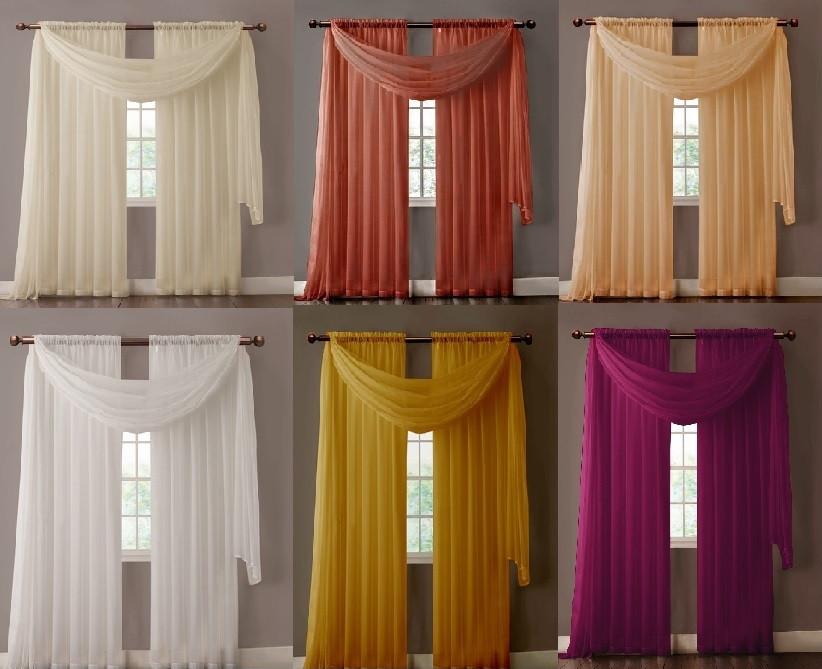
If you want to freshen up the look of a room by changing the curtains, but you don't know how to match the window coverings with the walls, floor and furniture, let your imagination run wild. Regarding the color, the top designers they ignore traditional colors and instead use bold colors from specific palettes. Using shades from color families is key to the ultimate combination. Texture and pattern can accentuate or soften colors in a palette. Color can make small spaces appear larger, create a thematic pattern within a space, or make large spaces appear smaller. If you want to match new curtains with other elements, such as rugs or walls, here are some tips and guidelines.

Looking at the outside world, we will notice dark and light gradations of light from the earth to the sky. The earth is dark, often showing shades of gray, brown and terracotta. The space between the earth and the sky is full of color, showing varying shades of green in the trees, brightly colored flowers and shades in the structured landscapes. The sky is brighter and more softly lit. Many decorators use this gradation from dark to light to match colors in a room.
If your floors are dark, use lighter shades in the vertical plane from floor to ceiling. Window coverings can be either light or dark, depending on the feel you want to create. For an airy and brighter space, use lighter colors and light fabrics. To accentuate darker shades, try heavier fabrics that diffuse or block light.
Classic colors also come from nature. The golden yellow hues of the sun combine well with shades of green that are reminiscent of trees or with the turquoise of the sea and water. Gray and brown shades are reminiscent of rocks and sand. If your space is mostly earthy, use curtains to add a little color. Curtains in cherry red or ochre can liven up the room without creating any color excess. Just make sure you choose a color that you can enjoy for a long time.

Some color combinations never go out of style. Perhaps the most classic combination is black and white. Black creates a sense of formality and dignity. White gives a sense of brightness and purity. If you have white walls, choose a soft shade of black for the windows. Dark curtains in contrast to light walls create a focal point at the window. A soft shade of black offsets the dense saturation of pure black. A layering offers the best of both worlds. Use dark color for mood, thermal insulation or to keep light out. White shades offer privacy as well as brightness when dark curtains are open.
Many designers combine shades of orange with shades of blue. Navy with tangerine or sky blue with persimmon are common examples. Play with these colors with shades that are in the same family. Texture can be used to emphasize a hue. A pattern can combine many colors included in the room's palette.
Blue and white are a beloved combination. The many different shades of blue, such as cobalt blue, navy, turquoise and robin's egg, all create a great contrast with white. Patterns define a theme. Gingham and plaids evoke the countryside, while geometric prints complement a modern or minimalist theme. Large, repeating patterns or puzzles give a playful feel to the window. Plain curtains soften it. Patterns can be used not only to highlight the dominant color of the room, but also to repeat all its shades.
Another way to use classic color schemes is to choose two dominant colors in the room and expand the palette by adding colors from the same family. Many designers recommend using a 60-30-10 scale for color balance. If you have one dominant color in the room, curtains can balance this ratio. For example, in a room where navy blue dominates and the secondary color is a deep red, the curtains can be combined to emphasize the colors without overwhelming the design. Pillows, rugs, and other accessories can also be used to add an extra touch of color and pattern.

If you're leaning towards a monochromatic decor scheme, pattern and texture will liven up your space. Window coverings, rugs and throw pillows can change the feel of a room. Mixing and matching different types of patterns, pattern sizes and colors can liven up a room. Texture can also work as an addition to your decor.
Don’t be afraid to mix patterns. There are, however, some basic rules when it comes to the right combination of patterns. You can even apply the 60-30-10 color ratio to pattern and texture. Choose three different patterns, such as chevrons, polka dots, and florals. Varying the size of the two patterns makes them stand out and creates interest. If you use a floral pattern for your curtains, try the same pattern on your pillows. Contrast the floral with a small geometric pattern and a stripe. The key is to combine colors and shades. Use one color as a theme and use related colors to create contrast and interest. Balance the patterns with solids so that the eye isn’t overwhelmed by too much color.
Some interesting patterns are ikat, plaids, toile, florals, chevrons and paisleys. Each of these creates a unique feel. Florals create a romantic atmosphere. Paisleys can give a bohemian look or add formality to a room. Chevrons fill the space with energy. They work well in sunny rooms, beach houses and bathrooms. Toiles are elegant and formal. Pair a toile pattern with a contrasting pattern, not a floral.
Damasks and jacquards use elements of both texture and design to create a distinct feel. Damask is elegant and formal, traditionally made from wool, silk or linen. The subtlety of the design is created by the weaving technique, which uses the threads in the warp and weft to create contrast in color, sheen and texture. Damask has a raised pattern that is seen in reverse from the opposite side. Damask holds up well, repels water and has a timeless look. Jacquards are similar patterns, but their texture is flat instead of raised. Both work great on curtains and can also be used on pillows for a repeating theme of color, texture and design.


Decorators and designers rely on the color wheel to find compatible colors and see how they relate to each other. The wheel includes shades around a circle, showing the relationship of primary, secondary, and tertiary colors to each other. The three primary colors are red, blue, and yellow. The three secondary colors are green, purple, and orange. Tertiary colors are shades of these and can be found on the wheel: red-orange, yellow-orange, yellow-green, blue-green, blue-purple, and red-purple. Colors that are opposite each other are complementary colors. Blue is opposite orange, which is why decorators pair these two colors together. Yellow is opposite purple, and red is opposite green.
Adjacent colors are called analogous colors. These colors can be used to change the tone or create an accent. If red is a dominant color, it can be softened by using a red-orange or red-purple hue. You can see how colors can create a feeling and how they reflect light. Combining contrasting colors can create a vibrant look. Opening a color with white or creating depth by using black can also change the look. Although they are not on the color wheel, neutral colors, such as light brown, white, gray, and black, are used to soften a look or as contrasting colors. The pattern and color of curtains can be used to complement, enhance, or dominate the color scheme of a room, always based on the science of the color wheel.
As you choose colors for your curtains and accessories, think about how colors affect emotions and comfort. Colors evoke feelings of warmth and coolness. Cool colors include blue, green, and purple, and their shades. Cool colors are associated with water, sky, and grass. They are relaxing, soothing, and invoke the intellect. Warm colors include yellow, orange, and red, and their shades. Warm colors suggest heat, fire, and sunshine. They are stimulating and invoke emotions. Looking at the color wheel, we see that warm and cool colors are on opposite sides of the wheel. This is because each color absorbs and reflects light differently. Light colors reflect light more than dark colors.
White and black also evoke feelings of warmth and coolness. White is cool and black is warm. Neutrals don't have much pizzazz on their own, although certain shades can have warm or cool undertones. However, when paired with color, they add elegance and excitement or reduce intensity.
By creating a contrast with warm and cool colors, you can play with the mood and create a sense of comfort. If you live in an area with a warm climate, choose cool colors for the windows of living rooms and bedrooms. If you live in an area with a cool climate, warm colors for the windows will contribute to the feeling of warmth in the interior.
Matching the color of your curtains to the purpose of the room helps create atmosphere. Deep, warm colors like burgundy work well in dining rooms, where guests want to feel comfortable. Bathrooms and bedrooms are often decorated in cool colors, as these are places where you want to relax. Bright red curtains on a window may interfere with your sleep. Balance is key. If your walls and floors are cool colors, try warm colors for curtains and accessories to balance the look.
If you like a color, explore it. Almost any color can be used if you pay attention to the scale, intensity of the hue, and how it combines with other colors. Analogous colors on the color wheel are often considered to clash, such as when using red and orange together. However, if you are using an analogous color to create a contrast or to reduce the intensity of the hues, this can work. In the 60-30-10 scheme, a fourth color can be added, by separating the secondary color.
If in doubt, take a few paint samples around the house. See how your choices match the wall color, floor coverings, and furniture. Think about the feel the colors and patterns will create. If you have antique rugs on the floors, you might want to keep them as a focal point. Use one of the secondary colors of the rug on the windows to complement and enhance the look of the space. If your floors are herringbone, a richly colored paisley curtain will complement both the pattern and the warmth of the wood.
Your living space should reflect your taste and lifestyle. While there are basic rules that help create a cohesive space, ultimately, it should appeal to your sense of beauty. Explore your tastes and experiment. If you work with a basic palette, accessories and window coverings can easily be changed to reflect the seasons, your mood, and your taste.